I recently submitted five street images from my recent trip to Cuba to LensCulture's 3rd Annual Street Photography contest and as a member of the LensCulture community, I received a submission review of my work. LensCulture recruits over 100 of the top photo editors, educators, portfolio reviewers, curators, and other industry professionals to give entrants constructive feedback on their photography and recommendations for improving their craft. I've received feedback on my work from members of the BKC family but it was a nice experience to have my work reviewed by someone whose only frame of perspective was my submission without having any biases or knowledge of my other work.
The following are the five images I submitted to the contest and the feedback I received on each one. I've annotated the review with hyperlinks to some of the photographers and images the reviewer is referring to; clicking each link will open a new tab, allowing you to take a quick detour and make your way back.
I'd love to hear what you guys think? What makes each image work? Which one is your favorite?
Title: Havana Streets
Artist Statement: There is so much more to Cuba than the typical vibrant postcards that leave the island of polished antique cars and sweating glasses of mojitos. The streets of Havana are filled with a grit and texture that is entirely their own; dotted with the island's greatest wealth ... the Cuban people.
Submission
Reviewer Feedback:
Dear Obed,
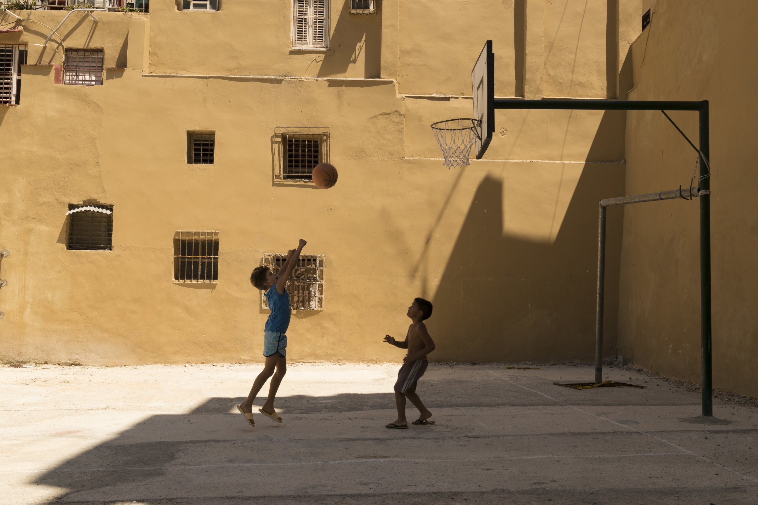
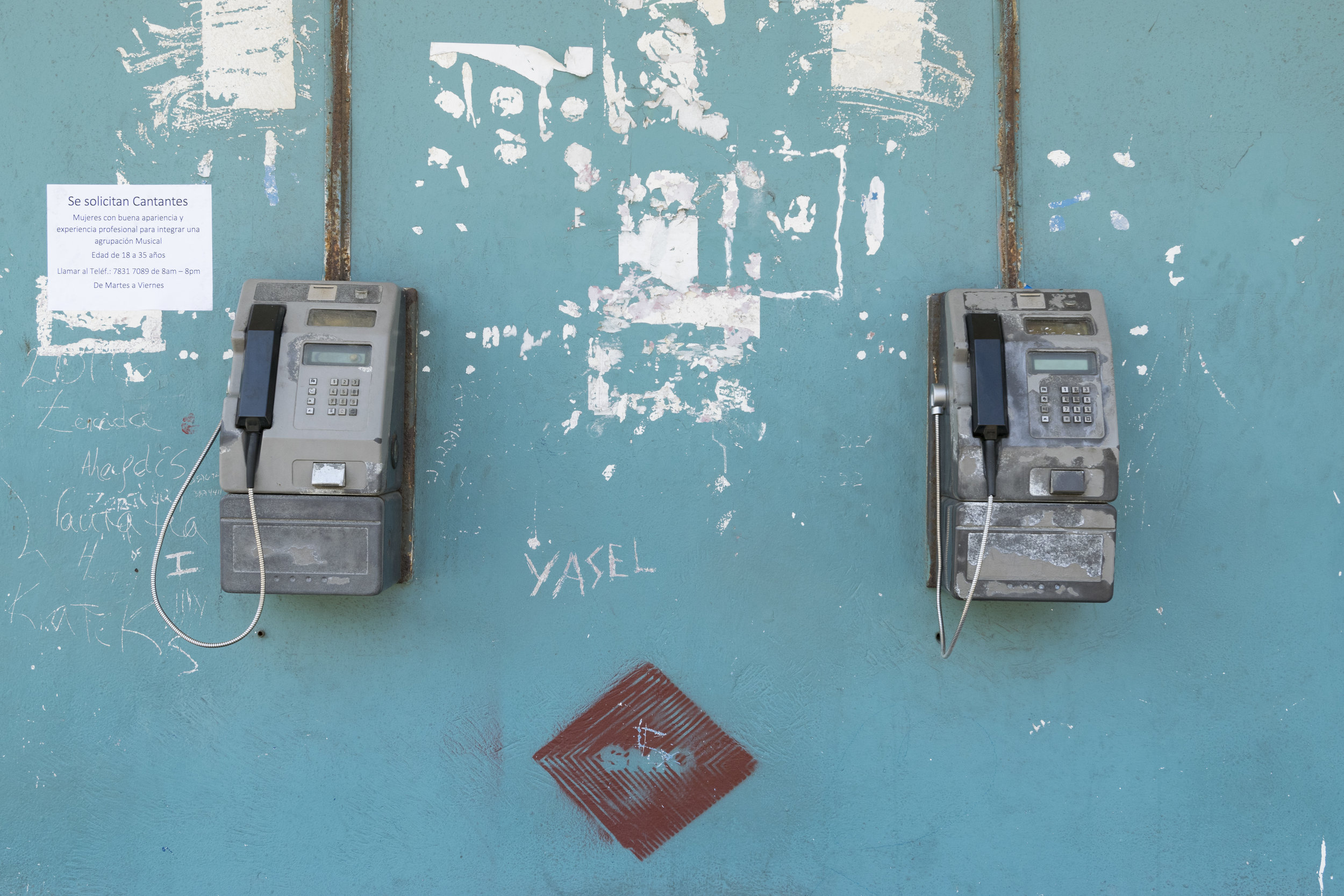
Thank you for sharing your work. You are correct in saying that there is more to Cuba than the stereotypical elements that leave the island in boatloads. I am pleased to see though that you haven’t shunned color, one of those elements that the Cuban social landscape is known for. In particular, your use of light and color give these images strength. For example, the two boys playing basketball has a great use of light, geometry, framing, and frozen time. The dynamic angle of the light illuminates the background while the boys play in the shadow. The way the basketball hoop’s pole mimics that geometry of the windows and structure in the background, as well as the light, lends the image a wonderful horizontal and vertical movement. It is playful and lyrical at the same time. The final image you’ve submitted (I’m calling it “Yasel”) is wonderful in its use of symmetry, color, and texture. The scratching of patterns and shapes and names recalls the petroglyphs of American Southwest cultures and of course the Cave Paintings that dot the European and Middle Eastern regions. This work is strong because it evokes the age old human mark-making habits that express mythology and story, each unique mark an action by someone not-imaged and in total the wall (your image) evokes a canvas of disjointed marks that create relationships amongst one another. The visual triangle between the phones and the red diamond create wonderful eye movement within the image. See Brassai’s graffiti and Siskind’s wall works.
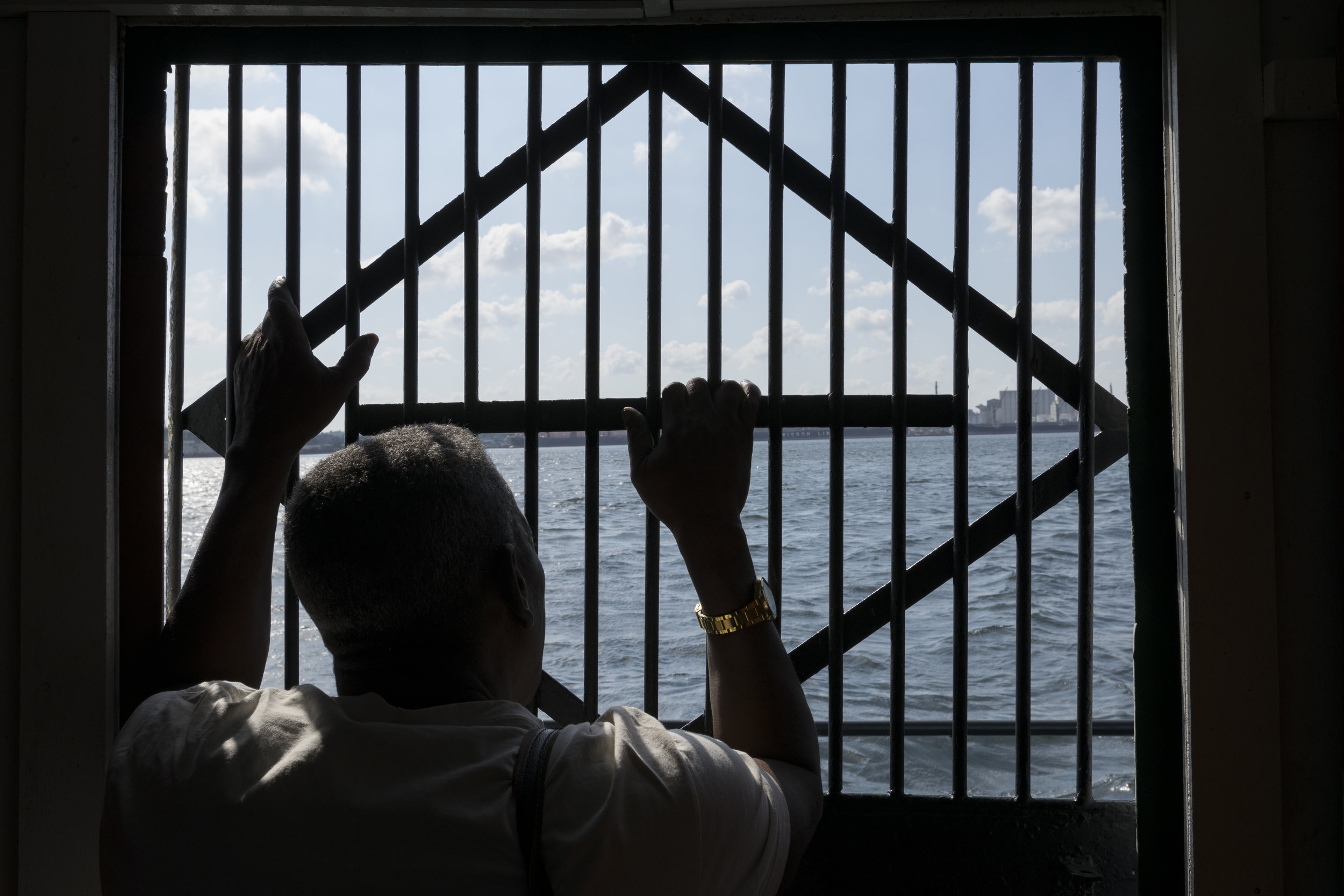
These two aforementioned images share in the notion of singular photographs. They are contained, and so exhibit the uniqueness of a solo image. They could belong to a book of photographs collected and sequenced based on their singularity (connecting by your style and methodology). I’m saying this because of your photograph of the man at the gate, that you describe as most indicative of the Cuban people, pushes at a narrative. This is the most communicative of the works here. The man at the gate peers out into a world he does not have access to. What is most interesting, and what I’ll call the punctum of the image, is the man’s gold watch. Real or not it stands out and causes a strange twist to the narrative that I find captivating. This work ought to be in a series based on isolation, the cultural elements that embody such a thing, and your lyrical approach to it. See Josef Koudelka’s “Wall,” Alec Soth’s “Dog Days, Bogotá,” Tim Hetherington’s “Inner Light.”
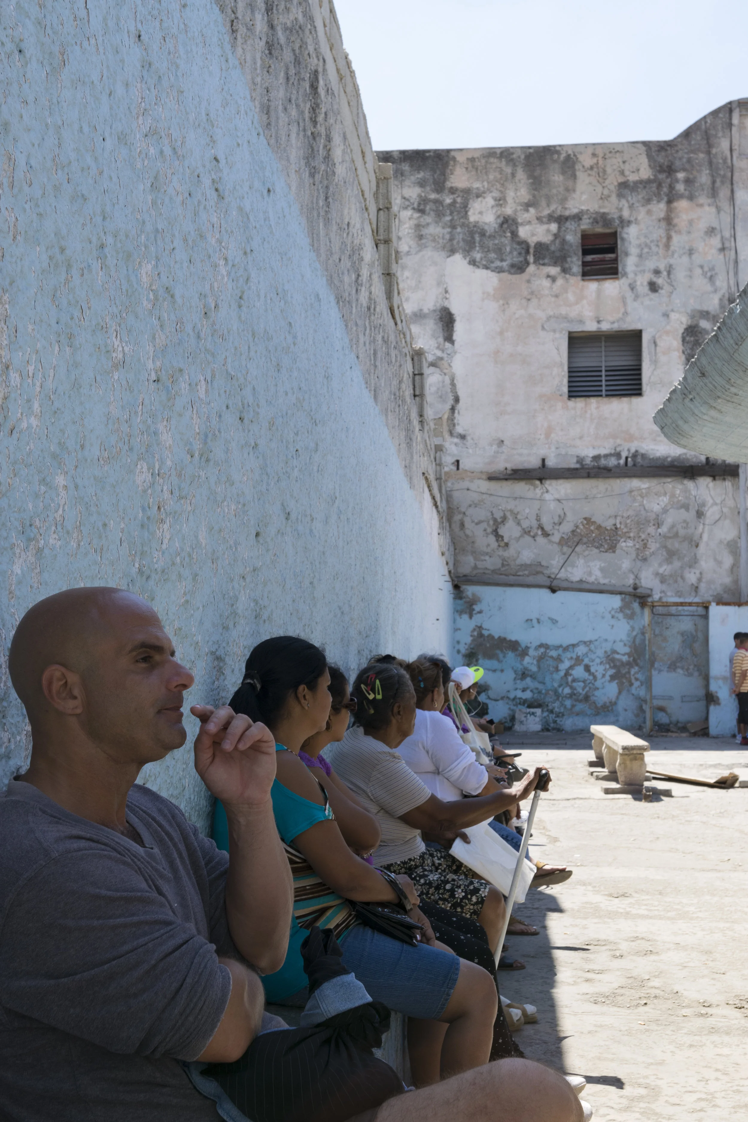
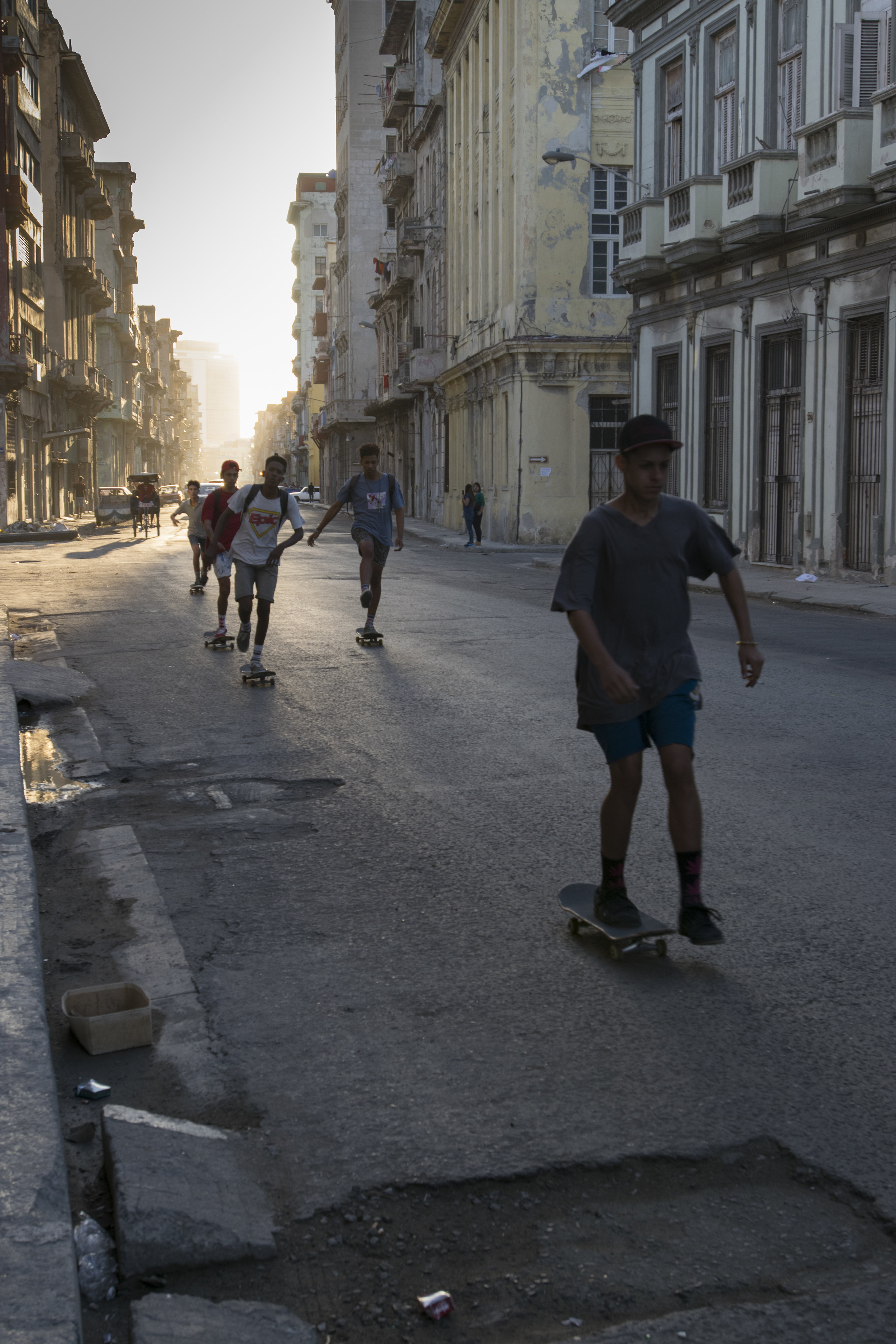
I think overall your approach is quite excellent. Your play with light, geometry, color, texture, formalism all convey your stylistic tendencies. I haven’t commented on the vertical images because they aren’t as compelling as the others (although I love the use of light in them!). I think improving here would entail focusing on the geometry of form, your use of color and light, as tactics in telling stories or evoking lyrical qualities in a scene. Build that into a body work that swells to something bigger than its individual parts (see Luigi Ghirri’s “Kodachrome”) is the next step. Good work takes strong photographs and allows them to speak to each other in some form or another. Try building these singular works into a book format. See how the shift and change based on alternating pages, recto/verso, and spreads.
I am linking to resources below. Again, thank you for sharing your work and I hope to see more in the future!
Ayyyyyyyyyyyyyyyye!!!
“I’m looking for a clear expression of an idea; I ask why is the photographer asking me to look at this? When reviewing hundreds of submissions, exceptional, well-executed work that animates an idea and is visually exciting really stands out and deserves to be recognized.”